Showing posts with label illustration. Show all posts

Sunday, November 21, 2010

Busy Bumblebee - Process


Gotta new documented process of my traditional paintings. It was a quick demo I did this Fall quarter at SCAD. The students have to do some sort of "manimal" (part human part animal) This is what you get when Yaritza Burgos (AKA "Bumblebee Man" from the Simpsons) gets a "Bee Movie" body and finds a job.

Prismacolor Pencil transfer to Strathmore Illustration Board. 10" x 7.5" image area. Taped off with Blue Safe Release tape.


Acrylic and Ink base colors. Watercolor was used for the clouds that I don't have a picture for.

Oil wash made with Dioxane Purple and Permanent Green Light thinned with Gamsol.

Dried oil wash removed with kneaded eraser revealing highlights and unifying shadows.

Prismacolor pencil details. and color shifts in certain areas.


Final flatbed scan color corrected with touched off with digital signature.

Details reveal lots of great texture and variations in colors.

Whole process took about 8 hours, but not all at once.


Tuesday, November 16, 2010

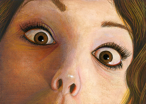
Before yours and her very eyes

Made this little video of one of my many painting methods. Painting was created with acrylic, watercolors, an oil wash, Prismacolor pencils, and gesso in about that order.

Video was created with iPhoto 11' slideshow. Limiting options but works OK. Real easy once you do it once right. This was my first time doing the slideshow.

Big Eyes Surprise

Tuesday, March 23, 2010

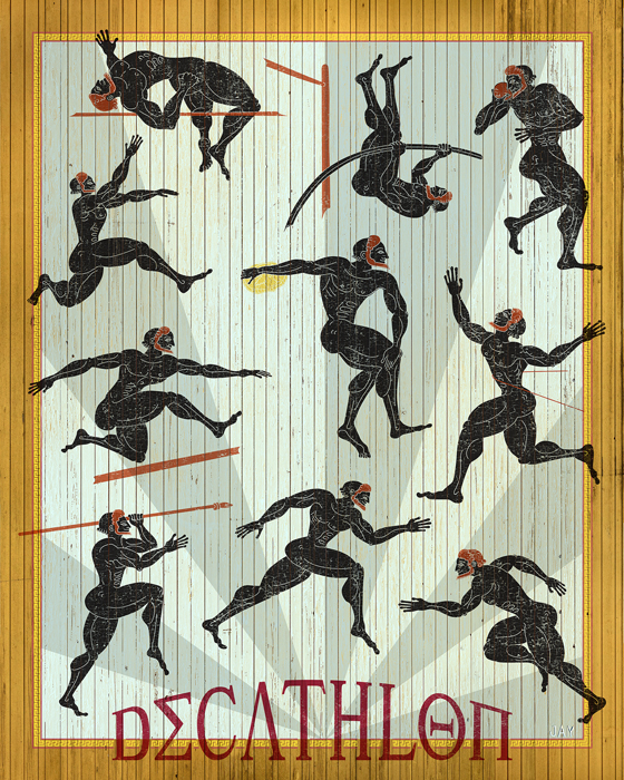
Decathlon Poster Process

New work!

A 16" x 20" poster I did as part of a demo for my Adobe Illustrator class a Portfolio Center. I just finished it today. I thought it turn out pretty good. Whada you think?


This part was done in Adobe Illustrator CS4.


I then copied certain grouped areas from Illustrator into a Photoshop document and created a series of Smart Object layers. Then I added various textures in the layers masks of the Smart Object layers.

Decathlon poster


The result is a the marriage of Illustrator and Photoshop. The best of both worlds.
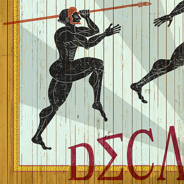
I love texture!!


Decathlon poster detail


Thursday, February 18, 2010

Brian Despain

SCAD Atlanta Illustration Dept. had a wonderful opportunity on Wed. Feb 17th with Illustrator turned fine artist Brian Despain. His Agent, Kirsten Anderson, of the owner and curator of Roq La Rue gallery in Seattle was scheduled for a lecture at SCAD on Feb 18th at 6pm behind the hub. Professors Mike Brown and Kenneth Knowles were working with Kirsten for the painting Dept. Brian was driving up from Florida (where he was staying) to meet with her at SCAD for some business. So we got lucky to have such an amazing talent or as his Dad would say "the best thing since sliced bread" to come a do a lecture and demo for the Illustration Dept. It was a great collaboration with the Painting and Illustration Departments that should happen more often. There was a pretty descent turn out with students and faculty. Thanks for all that showed up.

Brian <span class=

Brian was a wonderful speaker and a self admitted artist that likes to be in complete control of not only his paintings subject matter, but every step in his image creation process. Coming from a commercial art background doing a wide variety of graphic design jobs, photo-retouching, video game 3D Modeler, but never really a full-time freelance illustrator. Now for the past few years he has really hit the gallery scene with his stormy clouds, robots, fish, numbers and other elements that captivate the viewers attention much longer than the typical quick read illustration. He talked extensively about his philosophy of art and the connection with the viewer.
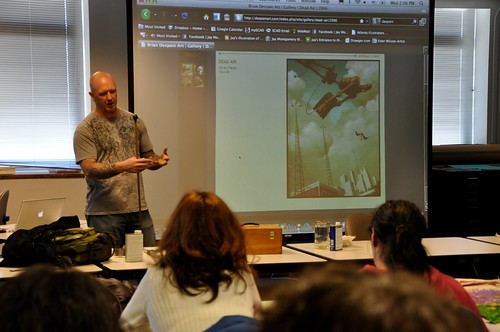
Brian <span class=

He had prepared a painting to start that was due in a month for a gallery show that his agent, Kirsten, was presenting. He starts with an idea, refines it with pencil, scans it in and in Photoshop and Painter he does a really tight color study while still working on fixing details, proportions and angles. This goes pretty quick with digital tools to take about 3 hours or so. Most of his work as relatively small , but he can but a ton a detail in the piece even at 8" x 10" or 11" x 14". The piece he was working on was 11" x 14". He "glues" a tight line drawing print to a sturdy hardboard. He does this first by sealing absorbent board with matte medium, sanding it smooth. Then he brushes on a layer of matte medium on the board and the back of the print which is on 3 ply bristol. He positions the bristol paper that is slightly larger than the board. Cuts off the excess paper. Then brushes it down and seals the bristol with about 5-6 thin coats (sanding in between dried layers) on top of the drawing. The results is a sealed smooth surface to paint on. He then prints out an color and black and white version of the color study.

<span class=

Painting in oils, Brian has a developed a very controlled and meticulous process that works very well for him. I certainly can't cover every aspect of his detailed painting process, but here is an overview from what I gathered. Feel free to further discuss this in the comments.

He uses the old masters technique of grisaille, which is basically starting with only gray tones of all the details of the painting then colorizing it with several thin layers of color on top of the dried grisaille. His gray color is a 1 to 1 mix of Ultramarine Blue (I think) and Burnt Sienna which produces a neutral gray. He has a special mix of his own oil medium which is three parts linseed oil, two to three parts stand oil and one or two parts oil of spike lavender. He likes the strength and elasticity of the stand oil but it’s too thick to use on its own, and the oil of spike is used as a diluent to speed drying time. Brian uses the oil of spike instead of say, turp as a diluent as it’s not as toxic though it is quite expensive. On his glass palette he adds his medium to the paint with a water dropper controlling the amount mixed in. With a palette knife he mixes then medium into both colors then mixes then together to create a neutral black. Then with white he mixes 4-5 grey tones on his palette.
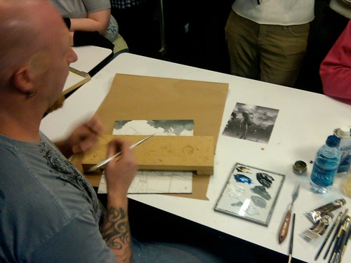
Brian <span class=
Then finally with cheap small fine haired flats, filberts, and round brushes he starts from the top down rendering the whole painting precisely in grey tones. His layers are very thin to increase the dry time but still stays workable on the board for the length of the painting session. Once the grisaille is dry he starts in with the color.

Brian <span class=

Brain uses a palette of 11 oil colors that he exclusively uses on all his paintings. He developed a set of color mixing charts showing how all the color interact with each other and by adding white in varying value ranges. He refers to this constantly during the coloring painting stage. His favorite brand of oil paint is Rembrant and some Daniel Smith. To colorize the grisaille he uses a bit more of the same medium without thinners for a glaze showing the tone underneath the color. A painting this size would take him about 2-3 days do to after all the prep work is done working full days and drying the painting overnight.
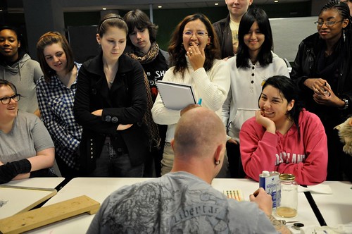
Brian <span class=

It was a real treat not only for the students, but the professors as well to see and hear about his philosophy of art and method of his madness and "pro tips". I know I was thoroughly enlightened! Thank you Brian for a fantastic and well-received lecture/demo. It was more than we all expected. You are welcome at SCAD anytime!

Tuesday, February 09, 2010

Aqua Teen Hunger Force background!

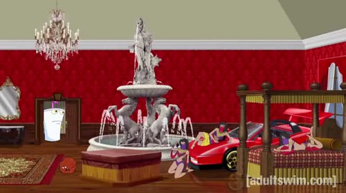
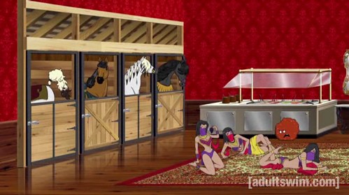
After working on 6 movie backgrounds for Cartoon Network's "Aqua Teen Hunger Force colon Movie Film for Theaters" (yes, this is the full title exactly). They called on my pixel pushing skills again for the TV show. Just this past Sunday the new episode of the Adult Swim TV show Aqua Teen Hunger Force "Rabbot Redux" aired and it had about 2 min of air time using a background I did! Took about 2-3 weeks to do back in December
2009. A bit about the creation process.

1. This is what the Art Director, Bob Pettitt, sent me as a starting point. This was used as a "holder" for the animation build of the scene. After talking with me about the scenes needs and he sending me a few texture files, food items for the salad bar I got started.


2. I established eye an level horizon line using one point perspective. Then I created most of the base mechanical/architectural shapes in Illustrator CS4 then by copying and pasting into Photoshop CS4 I created several smart object layers.


3. I sent progress to the AD a couple of times. I did not do the Ferrari. They already that done, I just had to make sure the perspective matched the rest and fit in between the bed and fountain. I had to make sure that the layers of objects were set up in such a way that the characters could go behind all the elements. So each object was on it's own layer with transparent backgrounds.


4. After creating in smart objects in Photoshop, I used them as clipping masks to add textures mainly. On some smart object layers I added shadows and highlights as clipping masks. This is the final background low res version. The original is 12000 x 3240 pixels (40in x 10.8in at 300 dpi) with 411 layers! High Def Baby!

Meatwad's Luxury Room

Some details - indoor horse stable!
Stable Detail


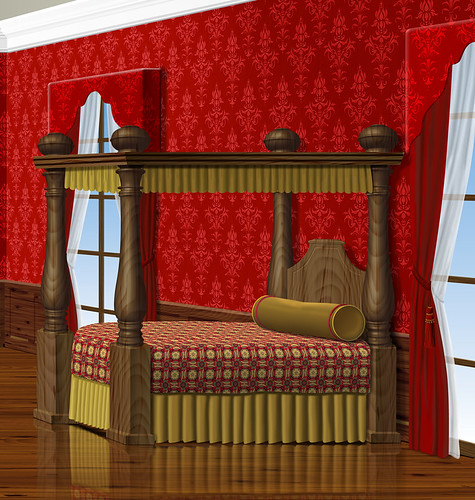
fancy luxury bed! I used the Vanishing Point filter and the Liquify filter to apply the bed spread pattern.
Bed Detail


Some screen shots of how they used them in the end. It was about 2 min of airtime. Pretty funny little scene.

Water Fountain, Lamborgini and Bed


Horse Stable, Salad Bar and Sexy Ladies

If you want to see the whole episode you can go to this direct link on the Adult Swim website, but I must warn you that it's NSFW, but not R rated. It's not the type of crude humor that everyone can appreciate. (If there is such a humor.) It's only a 15 min show, but to skip right to the scene go to the end of the first video clip and the next clip will load and it's toward the beginning of that video file.


Sunday, January 24, 2010

Robot Dilemma Process


What's on the easel now is a acrylic grisaille with oil color.


Thumbnail base idea.


Tighter sketch, but still did not like the girl.


After a pencil tight I did a value study in Photoshop. Better girl but still not right.


Acrylic grisaille on yellowish base with only black paint and no highlights. I also fixed the girls pose a bit to show the bomb behind her back more visible to the viewer not the robot.


Oil coloring process.
This is about 2-3 layers in the sky and one layer on the robot and ground.


More to come.


Saturday, November 21, 2009

New Illustrated Book!

You might recall an earlier post about a new book I illustrated. Well it's out! Just in time for the holiday's a yet another new book about Christmas...but this time it's special because it's illustrated by me! It's a different take on the ever popular poem "The Night Before Christmas" with 11 new highly detailed illustrations. "The Night After Christmas" by Jim Chapman was a challenge to illustrate and fun at the same time. I wanted to capture a more contemporary approach to the old tale to fit the modern subject matter of the this timely poem. It's about the cultural materialism that retailers have trapped us into forgetting the true meaning of Christmas. Here is a great description from the publisher Winepress Group.

Does Christmas seem like a stressful, unsatisfying ritual? Why do we go through this annual exercise of decorating, shopping, wrapping, and over-spending--only to vow we're going to do it differently next year? Was Christmas always this way? Or did our culture make it into something it wasn't meant to be?

If you've ever asked yourself these questions, you may well need this book. Christmas does, indeed, offer something more. Obscured beneath the tree, hidden inside the gift wrap, buried under plastic debt lies an enduring enigma that beckons us to reconsider. Somewhere in all the clutter can be found the key to a merry Christmas. For those who take a second look, there awaits a gift that can make every day a holiday.

"Delightfully riveting and insightful...I'm sure every person can relate. What a great reminder of what we so often forget!"

--Gary Smalley


It's a very nicely printed 24 page 8" x 8" hardcover cover book with book sleeve and spot varnishes. I designed the cover as well as illustrated it. I wanted to show hints of money in the design so I used a The colors turned out exactly how I wanted them. At first glance it's a typical Christmas book but at a closer look of each illustration you see something more. I had fun coming up with all the viewpoints compositions and details. The look of the credit cards were challenging for both the author and I. Since we could not show any credit card logos or anything close I had to come up with generic cards with all sorts of details. We went through several revisions until the author and his lawyer were satisfied that we were not going to be sued by the very companies that push all this materialism down our throats every holiday season. If you know what my family and I look like you will get a laugh at my photo references as well.

Now I have a book to give to my family this year for Christmas. Maybe your Christian friends or family would like a copy. It does make a great gift! I would love to hear what you think of the book and illustrations.

I would happily hand sign any books for free. Just let me know. jay at jaymontgomery dot com

Tuesday, November 03, 2009

I'm featured in a new Freelance Portfolio E-zine!


Greg Welch
is a designer that specializes in magazine publishing. He has done a great deal of print magazines and has been doing some impressive online magazines and PDF portfolios for all types of artists. He created this new Freelance Portfolio online magazine. One of my illustrations is featured in the premier issue on the cover and here it is. He promotes it heavily online and is gaining some traction and a bit of controversy even. Want to be apart of it contact Greg.


Sunday, November 01, 2009

Ya Ya Kids T-Shirt Illustration

Recently finished a new Ya Ya Kids shirt for Manic Mommies Podcast. I had done 4 other traditionally with watercolor then touch up in Photoshop. This one was done in Photoshop after an creating a tight pencil with graphite.

No Whine Allowed

Here is video I created about my process.


Saturday, August 29, 2009

Night After Christmas - sketches

I have been working on a new picture book of sorts for marketed towards adults for Winepress Publishing since early March 2009. It's called Night After Christmas - A Holiday Paradigm Revisited. by Jim Chapman. It's a take on the poem The Night Before Christmas by an anonymous author first published in 1823. It deals with a modern families struggle of materialism and lost sight of what Christmas was really all about. I did 10 full page illustrations plus a cover in a stylized realism manner. I had lots of fun coming up with the scenery which is loosely based off my own home and family. I had about 3 months to do 11 full blown, full page illustrations with repeating characters and scenes all while teaching 2 classes, taking 1 MFA class and many other freelance jobs. I thought I was done in June and then the author had lots of little revisions to some of the illustrations starting a few weeks ago. I got final approval on all the illustrations just last week! It's due to be printed and in the stores hopefully in a couple of months just in time for Christmas.

I wanted to give you first a taste of the process of some of the illustrations. I always start with pencil and here are some sketches I sent the publisher. The author had some very specific art direction from a Word doc and the story obviously gave some clues to set the scene. I had already done a fair amount of research and photo reference.


So from these I digitally painted the scenes in Photoshop and Painter. The finals are coming in a later post.


Saturday, July 18, 2009

Saturday, June 06, 2009

Spiritual Connections

It's been a while since I was an official student of the arts. Since 2000 I have been a teacher of the arts. Well I started the journey of getting my MFA so that I could have the opportunity to teach full-time at a college level. The logical and most practical choice was to get my MFA from the place I teach, SCAD-Atlanta. I could teach and take classes at the same time all in the same place. Well this past quarter I did just that. I taught 2 classes (Getting Published, and Self Promotion for Illustrators) and took my first class with Illustration professor Julie Mueller-Brown. It was grueling financially, physically, and mentally! During the middle of the quarter I found a more flexible and faster way to get my MFA at Hartford Art School, Limited Residency MFA in Illustration. So I won't be continuing with SCAD for my MFA in Illustration. More on that later.

ILLU 714 Drawing for Illustrators was a great course to start off with and therapeutic in many ways. For the first time in a long time I had allotted time to draw for me. Well, I was drawing for my professor but it was much more wide open than any other paying freelance gig I have done in over 16 years. The 7 other students and I did TONS of drawing inside and outside of class. Part of it was to create 5 personal graphite drawings outside of class. Julie wanted us to just start scribbling on nice drawing paper and see what happened. Below is my journey of those drawings. She is going to use my series of drawings as an example of the process for when she gives this assignment again. I went from literal symbols and words to almost abstract expressionism. Very different from what I am used to and a breath of fresh air.


I would love to get any feedback on these good or bad.

Tuesday, June 02, 2009

Vote for my T-Shirt Design!

Run, MILF, run. - Threadless T-shirts, Nude No More


Thursday, May 28, 2009

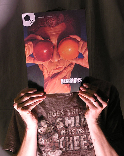
I'm on the cover of Oz

My work is featured on the cover of Oz Magazine for the May/June 2009 issue! Oz is a Southeast regional magazine leader in the Creative Communications Industry publications. Also, in the magazine I'm featured in an article titled “Undercutting”. I represent an Illustrator’s point of view on pricing illustration, educating the client and negotiating effectively with all types of clients. The magazine is not online yet, but distributes them at various retail outlets around Atlanta that tend to cater to the communication, marketing and media professional, like Sam Flax, King Plow Art Center, Utrecht, Binders and others.


Friday, May 22, 2009

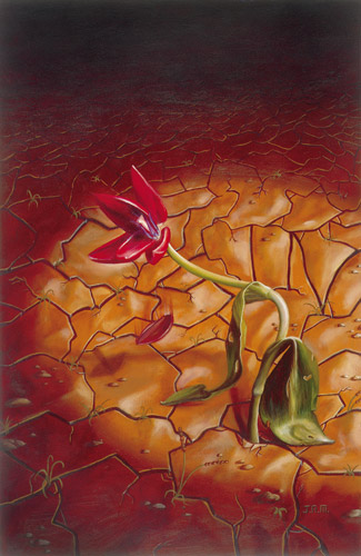
Illustration Friday - Cracked

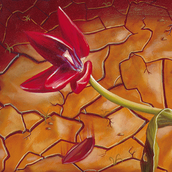
Oil painting about 12 x 20 done way back in 1997! Cover article about the Death of Calvinism. A dying tulip in a cracked landscape. The flower represents Calvinism and the dried up land is the lack of interest and nourishment of this theological system. Interesting to note: I snuck in the word SIN into the cracks and was caught! Had a great relationship with the Art Director and went on to do many many more covers and inside art for Tabletalk.

Dying Flower


Dying Flower detail

Tabletalk cover

Monday, April 27, 2009

Bridging These Truths Publicity Galore!

On Tuesday the 21st of April my family and I were asked to come to an Image Awards ceremony at the Emory University Chapter of the National Association for the Advancement of Colored People (NAACP). They were honoring student leaders with awards. Great group of people indeed. At the end of the ceremony they unveiled my poster of Bridging These Truths. The my client and visionary Brenda Stanley and I donated a 30" x 18" canvas gallery wrap of the poster to the NAACP chapter. It will be displayed in the TV lounge of the Dobbs University Center in a week with a plaque of recognition. Here is the article about it in the Emory Wheel.


The poster also posted on a very popular blog www.yourobamaupdate.com with a link to my prints for sale web page. You might have to scroll waaaay down to see the post but it's there!

A large framed print of this also was recently auctioned off at the 2009 SCAD-Atlanta Scholarship Gala donated by your truly.

It has been talked about at length on the radio, speeches, presentations and the Georgia School Board is very interested in displaying it in a large amount of their schools.

It's getting LOTS of other publicity, sales and traction even 100 days into Obama being in the White House.

It's also not to far fetched that the poster will be seen and given to Michele Obama. Because it's not what you know it's who you know and Brenda knows!

Stay tuned!

Jay

Friday, April 24, 2009

Illustration Friday - Theater

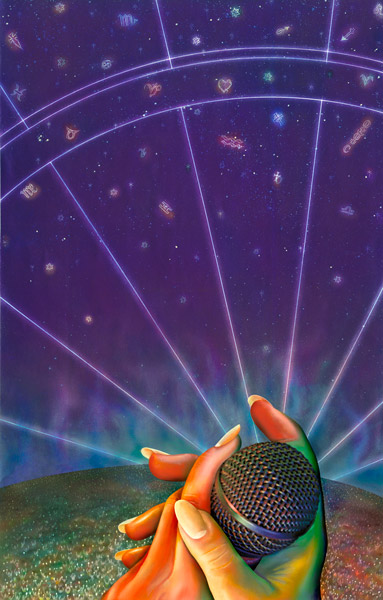
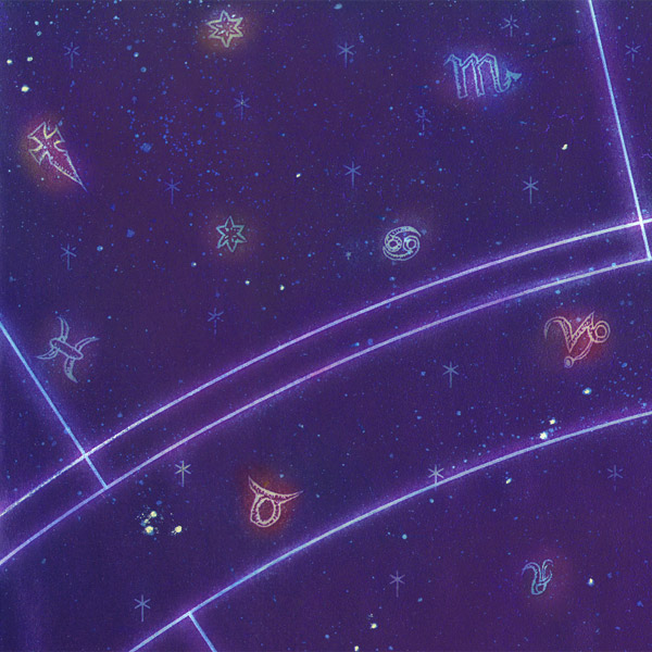
Oldies but goodie. Did this back in 1994 I think while taking a class with Bill Mayer. I was influenced by his bright colors. This was a piece to represent an outdoor amphitheater. The music I was listening to was Enigma.

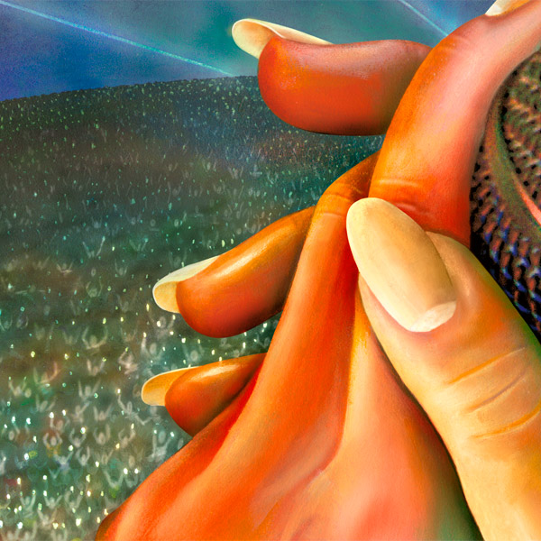
11x17 color laser print of background painted on top of with oils. Hands, crowd and smoke mist are oils. Microphone was painted in oils the covered over with a photo that I took for the reference. There were some minor tweaks to the scan in Photoshop but I say what ever it takes to get it the way you want it.


Friday, April 10, 2009

Ya Ya Kids are worldwide!

As in all over the world wide web. This week the marketing efforts of the Ya Ya moms and owners of Ya Ya Kids had a great little shout out on a very popular and current podcast I clued them in on. Manic Mommies is an audio podcast for any manic mommy. What mommy is not a MANIC MOMMY? Anyway, why this is important? I did all the illustrations for the shirts and I did their logo! It's cool to hear about other talking about your work unprovoked! Check it out below.

Here is the link to the Manic Mommies show notes where you can download the show as an MP3, or listen on iTunes. Listen to the whole thing or fast forward to about 16 min. and then again at 50 min.


For all you mom's it would mean a lot to me to check out the Ya Ya Kids website and buy a shirt. They are very cool! Super soft high quality environmental friendly shirts that are made in the USA.

http://www.yayakids.com


Sunday, March 29, 2009

Life Drawing Portfolio

Just put together a life drawing portfolio. I recently went to a SCAD's life drawing session held on Fridays. i have not been in a while and really dig it. I want to do more and more. Created this in Keynote and exported out as a web presentation. Let me know what you think of the drawings.

Saturday, March 14, 2009

Resort Map

A while back in the beginning of November I was contacted by the owner of Chestnut Bay Resort in Northeast Alabama. He needed an illustrative map of his resort on Lake Weiss. He tried to get done through a relative and disaster stuck with this rejected map.


So he sought out a professional. He invited me to come up and take some photos and walk around the place. I can't remember the last time I was in Alabama, but before this trip I had never been to Centre, Alabama. The resort was unexpectedly nice and new and still expanding. Great for family retreats and lots of outdoor activities. So got the photos in Winter time and had to make the birds eye map for Spring or Summer time. I was quite swamped with SCAD and other freelance so I brought on board my good buddy John Nelson to help me out.

I met with John and talked about the basic layout and details and without him actually going to the Resort he sketched out in Photoshop a fairly accurate rendition of the place.

After a couple of rounds of over the phone revisions we had a final drawing.

Then I colored it in Photoshop.


They are going to use it on brochures, a large poster and a homepage clickable map showing photos of the different areas. See it on the ChestnutBayResort.com.