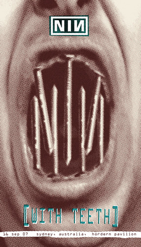
This is a quick demo I did for my advertising class for a Nine Inch Nails concert poster. I used a photo of me, some nails, and the color halftone filter in Photoshop. I was going for a 3 color silkscreen look. Whole process took about 2 hours tops.

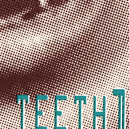
Detail of the dots which were roughened with a few filters. It's not my usual, but it was fun and thought I would share. Is this hokey, cool, scary, or what?


2 comments:
Hi! I saw your post in nin web site. Your ilustrations are great! I like it!, I`m a graphic designer, I´m from Buenos Aires, Argentina. I love ilustration too, It´s a great idea to design a poster about nin, I will try it!
bye!
Very Cool! NIN rocks also!
Say... since we're on the scene of halftone dots, I want to inform everyone of high quality vector halftone dots.
http://vectorstock.com/gallery/1078/
For $1 you can get a crispy clean & round dot pattern. No more live tracing or funky photoshop halftones.
Check it out!
Ted
Post a Comment