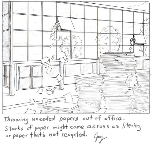
Assignment for a Mortgage Servicing News. Art director's brief description is pretty much all I got: "man in small office building throwing papers out of window.
Pile of paper on the street..." I took it a bit further adding too many details.
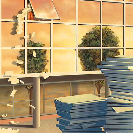
This is the concept that the AD asked for and eventually went with.
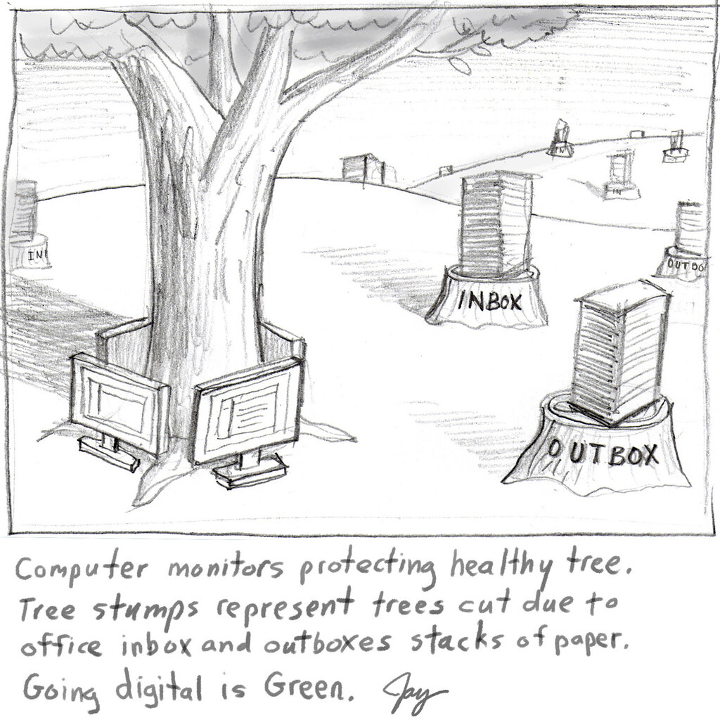
 This is another concept that the AD did not ask for but liked better. The editor liked the other requested concept so the AD had to comply. This has happened over and over again with editorial clients. I thought it was the AD's job to pick the artist and the art. Isn't that what they went to school for?
Pile of paper on the street..." I took it a bit further adding too many details.
This is the concept that the AD asked for and eventually went with.
 This is another concept that the AD did not ask for but liked better. The editor liked the other requested concept so the AD had to comply. This has happened over and over again with editorial clients. I thought it was the AD's job to pick the artist and the art. Isn't that what they went to school for?
I had originally painted the colors as a normal blue sky day. I liked the way a changed it. After some thumbnail sketches it was totally created on the Mac using Illustrator CS3 most 85% of the shapes and Photoshop for the painted looking parts. Total time: about 10 hours on and off for a week.


No comments:
Post a Comment