For the past 6 years I have had the honor to do the main trade show image for the Hinman Dental Meeting. The largest dentist convention in the USA held in my home town of Atlanta. Every year we come up with a new concept on basically the same topic of continuing education in Dentistry. This years theme was Quality Continuing Education Served with Southern Hospitality. So I had the idea of showing a server with a serving dome in a southern type home. They wanted to include all sorts of native trees, and a porch with a rocking chair. At first the image seemed simple enough to illustrate. But there were lots of depth and layers to the piece that needed to all work together and it proved to be more complicated than I imagined.
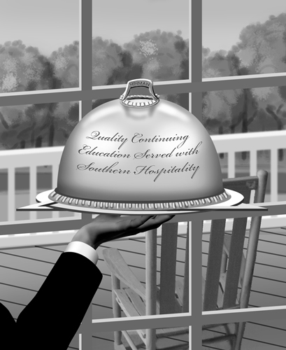
After doing a scribble sketch at a meeting with client. I started building this in Photoshop using mainly shape layers. Knowing that the layers would be moved around to come up with the best composition. This composition proved to be to complicated with too many panes and needing an opening in the porch railing.

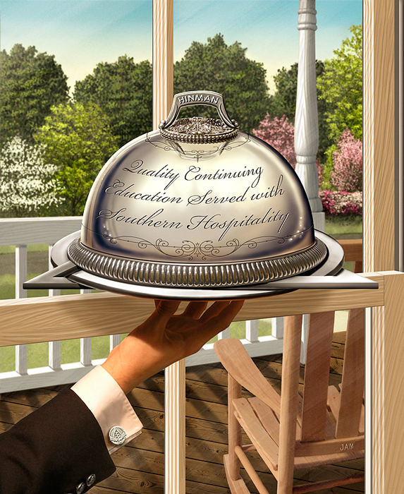
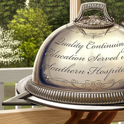
This was better but it was hard to tell that the server was inside the house. Plus the hand look like it had only three fat fingers. The angle of the fingers were a challenge to show all of them naturally. See the final hand below. The plate that the serving dome is on is in the shape of a circle and triangle which is the main part of the dentistry logo.

Final approved illustration. Notice the Hinman logo was used as the cuff-link.

To add pop to the image I slightly blurred the background. All elements are on there own layer. I also added a very subtle texture.

Let me know what you think?


3 comments:
I love all the hidden (but no so hidden) elements! This is definitely a '10' I know they were/are well pleased with this!
Looks awesome, Jay! Love the detail, especially on the dish. Only thing I would say is that I didn't realize at first that the covered dish was inside. I think maybe b/c there isn't a clear enough differentiation between inside and outside elements to me. The background blur helped, but I might even cool down the background foilage colors and/or make the window glass read better somehow. If the dish is that close to the window might there be a slight reflection of it in the glass? I'm not sure. But I'm being picky, of course, great job as is!
Yes, Hinman is a big deal conference for dentists - my father in law included. Glad to know you have been their "official" illustrator for 6 - now 7 - years running. Great illustration! Tough to do silver but you nailed it with the detail. Nice type treatment. Thanks for sharing the stages.
Post a Comment