Showing posts with label recent work. Show all posts

Sunday, November 21, 2010

Busy Bumblebee - Process


Gotta new documented process of my traditional paintings. It was a quick demo I did this Fall quarter at SCAD. The students have to do some sort of "manimal" (part human part animal) This is what you get when Yaritza Burgos (AKA "Bumblebee Man" from the Simpsons) gets a "Bee Movie" body and finds a job.

Prismacolor Pencil transfer to Strathmore Illustration Board. 10" x 7.5" image area. Taped off with Blue Safe Release tape.


Acrylic and Ink base colors. Watercolor was used for the clouds that I don't have a picture for.

Oil wash made with Dioxane Purple and Permanent Green Light thinned with Gamsol.

Dried oil wash removed with kneaded eraser revealing highlights and unifying shadows.

Prismacolor pencil details. and color shifts in certain areas.


Final flatbed scan color corrected with touched off with digital signature.

Details reveal lots of great texture and variations in colors.

Whole process took about 8 hours, but not all at once.


Tuesday, March 23, 2010

Decathlon Poster Process

New work!

A 16" x 20" poster I did as part of a demo for my Adobe Illustrator class a Portfolio Center. I just finished it today. I thought it turn out pretty good. Whada you think?


This part was done in Adobe Illustrator CS4.


I then copied certain grouped areas from Illustrator into a Photoshop document and created a series of Smart Object layers. Then I added various textures in the layers masks of the Smart Object layers.

Decathlon poster


The result is a the marriage of Illustrator and Photoshop. The best of both worlds.
I love texture!!


Decathlon poster detail


Friday, January 15, 2010

Served with Southern Hospitality


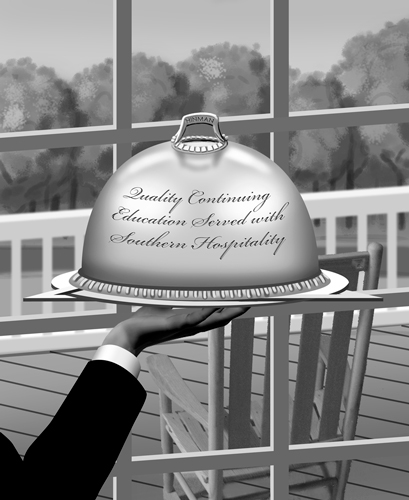
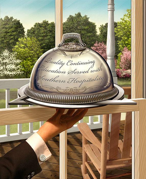
For the past 6 years I have had the honor to do the main trade show image for the Hinman Dental Meeting. The largest dentist convention in the USA held in my home town of Atlanta. Every year we come up with a new concept on basically the same topic of continuing education in Dentistry. This years theme was Quality Continuing Education Served with Southern Hospitality. So I had the idea of showing a server with a serving dome in a southern type home. They wanted to include all sorts of native trees, and a porch with a rocking chair. At first the image seemed simple enough to illustrate. But there were lots of depth and layers to the piece that needed to all work together and it proved to be more complicated than I imagined.


After doing a scribble sketch at a meeting with client. I started building this in Photoshop using mainly shape layers. Knowing that the layers would be moved around to come up with the best composition. This composition proved to be to complicated with too many panes and needing an opening in the porch railing.


This was better but it was hard to tell that the server was inside the house. Plus the hand look like it had only three fat fingers. The angle of the fingers were a challenge to show all of them naturally. See the final hand below. The plate that the serving dome is on is in the shape of a circle and triangle which is the main part of the dentistry logo.


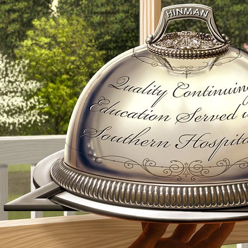
Final approved illustration. Notice the Hinman logo was used as the cuff-link.


To add pop to the image I slightly blurred the background. All elements are on there own layer. I also added a very subtle texture.


Let me know what you think?

Sunday, November 01, 2009

Ya Ya Kids T-Shirt Illustration

Recently finished a new Ya Ya Kids shirt for Manic Mommies Podcast. I had done 4 other traditionally with watercolor then touch up in Photoshop. This one was done in Photoshop after an creating a tight pencil with graphite.

No Whine Allowed

Here is video I created about my process.


Saturday, August 29, 2009

Night After Christmas - sketches

I have been working on a new picture book of sorts for marketed towards adults for Winepress Publishing since early March 2009. It's called Night After Christmas - A Holiday Paradigm Revisited. by Jim Chapman. It's a take on the poem The Night Before Christmas by an anonymous author first published in 1823. It deals with a modern families struggle of materialism and lost sight of what Christmas was really all about. I did 10 full page illustrations plus a cover in a stylized realism manner. I had lots of fun coming up with the scenery which is loosely based off my own home and family. I had about 3 months to do 11 full blown, full page illustrations with repeating characters and scenes all while teaching 2 classes, taking 1 MFA class and many other freelance jobs. I thought I was done in June and then the author had lots of little revisions to some of the illustrations starting a few weeks ago. I got final approval on all the illustrations just last week! It's due to be printed and in the stores hopefully in a couple of months just in time for Christmas.

I wanted to give you first a taste of the process of some of the illustrations. I always start with pencil and here are some sketches I sent the publisher. The author had some very specific art direction from a Word doc and the story obviously gave some clues to set the scene. I had already done a fair amount of research and photo reference.


So from these I digitally painted the scenes in Photoshop and Painter. The finals are coming in a later post.


Saturday, June 06, 2009

Spiritual Connections

It's been a while since I was an official student of the arts. Since 2000 I have been a teacher of the arts. Well I started the journey of getting my MFA so that I could have the opportunity to teach full-time at a college level. The logical and most practical choice was to get my MFA from the place I teach, SCAD-Atlanta. I could teach and take classes at the same time all in the same place. Well this past quarter I did just that. I taught 2 classes (Getting Published, and Self Promotion for Illustrators) and took my first class with Illustration professor Julie Mueller-Brown. It was grueling financially, physically, and mentally! During the middle of the quarter I found a more flexible and faster way to get my MFA at Hartford Art School, Limited Residency MFA in Illustration. So I won't be continuing with SCAD for my MFA in Illustration. More on that later.

ILLU 714 Drawing for Illustrators was a great course to start off with and therapeutic in many ways. For the first time in a long time I had allotted time to draw for me. Well, I was drawing for my professor but it was much more wide open than any other paying freelance gig I have done in over 16 years. The 7 other students and I did TONS of drawing inside and outside of class. Part of it was to create 5 personal graphite drawings outside of class. Julie wanted us to just start scribbling on nice drawing paper and see what happened. Below is my journey of those drawings. She is going to use my series of drawings as an example of the process for when she gives this assignment again. I went from literal symbols and words to almost abstract expressionism. Very different from what I am used to and a breath of fresh air.


I would love to get any feedback on these good or bad.

Tuesday, June 02, 2009

Vote for my T-Shirt Design!

Run, MILF, run. - Threadless T-shirts, Nude No More


Monday, April 27, 2009

Bridging These Truths Publicity Galore!

On Tuesday the 21st of April my family and I were asked to come to an Image Awards ceremony at the Emory University Chapter of the National Association for the Advancement of Colored People (NAACP). They were honoring student leaders with awards. Great group of people indeed. At the end of the ceremony they unveiled my poster of Bridging These Truths. The my client and visionary Brenda Stanley and I donated a 30" x 18" canvas gallery wrap of the poster to the NAACP chapter. It will be displayed in the TV lounge of the Dobbs University Center in a week with a plaque of recognition. Here is the article about it in the Emory Wheel.


The poster also posted on a very popular blog www.yourobamaupdate.com with a link to my prints for sale web page. You might have to scroll waaaay down to see the post but it's there!

A large framed print of this also was recently auctioned off at the 2009 SCAD-Atlanta Scholarship Gala donated by your truly.

It has been talked about at length on the radio, speeches, presentations and the Georgia School Board is very interested in displaying it in a large amount of their schools.

It's getting LOTS of other publicity, sales and traction even 100 days into Obama being in the White House.

It's also not to far fetched that the poster will be seen and given to Michele Obama. Because it's not what you know it's who you know and Brenda knows!

Stay tuned!

Jay

Friday, April 10, 2009

Ya Ya Kids are worldwide!

As in all over the world wide web. This week the marketing efforts of the Ya Ya moms and owners of Ya Ya Kids had a great little shout out on a very popular and current podcast I clued them in on. Manic Mommies is an audio podcast for any manic mommy. What mommy is not a MANIC MOMMY? Anyway, why this is important? I did all the illustrations for the shirts and I did their logo! It's cool to hear about other talking about your work unprovoked! Check it out below.

Here is the link to the Manic Mommies show notes where you can download the show as an MP3, or listen on iTunes. Listen to the whole thing or fast forward to about 16 min. and then again at 50 min.


For all you mom's it would mean a lot to me to check out the Ya Ya Kids website and buy a shirt. They are very cool! Super soft high quality environmental friendly shirts that are made in the USA.

http://www.yayakids.com


Sunday, March 29, 2009

Life Drawing Portfolio

Just put together a life drawing portfolio. I recently went to a SCAD's life drawing session held on Fridays. i have not been in a while and really dig it. I want to do more and more. Created this in Keynote and exported out as a web presentation. Let me know what you think of the drawings.

Saturday, March 14, 2009

Resort Map

A while back in the beginning of November I was contacted by the owner of Chestnut Bay Resort in Northeast Alabama. He needed an illustrative map of his resort on Lake Weiss. He tried to get done through a relative and disaster stuck with this rejected map.


So he sought out a professional. He invited me to come up and take some photos and walk around the place. I can't remember the last time I was in Alabama, but before this trip I had never been to Centre, Alabama. The resort was unexpectedly nice and new and still expanding. Great for family retreats and lots of outdoor activities. So got the photos in Winter time and had to make the birds eye map for Spring or Summer time. I was quite swamped with SCAD and other freelance so I brought on board my good buddy John Nelson to help me out.

I met with John and talked about the basic layout and details and without him actually going to the Resort he sketched out in Photoshop a fairly accurate rendition of the place.

After a couple of rounds of over the phone revisions we had a final drawing.

Then I colored it in Photoshop.


They are going to use it on brochures, a large poster and a homepage clickable map showing photos of the different areas. See it on the ChestnutBayResort.com.

Saturday, February 28, 2009

Life drawing and the Masters program at SCAD

A few weeks ago I did a still life drawing for my portfolio submitted to the SCAD MFA in Illustration application. I had fun coming up with what I was going to draw. I thought it turned out really well for a 2 hour rendering.


Check out my whole MFA in Illustration Portfolio let me what you think.


Sunday, February 08, 2009

World of Wine Map!

This map is a long time coming. I started working on this in July of 2005 with restaurant owner Tim Moore. It was to be a 11 foot by 5 foot mural for his restaurant Terra Grille which is now Terra Terroir. We went through what seemed like countless revisions and tweaking with all the info on the map.

It's a vinographically correct map of the world. A term we coined when producing the map. The state and countries are enlarged to the size of importance and quality of vineyards in the region. On the left hemisphere is the "old world" way of wine making and on the right hemisphere is regions that produce wine in a relatively modern way. It has tons of facts, popular vineyard locations, and interesting tidbits for all wine lovers. When seen at a large scale it's great conversation starter for wine enthusiast.

Then sometime in late 2006 the job stopped for due to a change in direction of the restaurant decor and Tim starting a family. The job was put on hold indefinitely. Then in late 2008 I decided to finish this map and make it my own since no reproduction rights were ever sold. I changed the name of the map and some descriptions and made it more my own. Now it's done and available for sale as prints, posters, and reproduction rights. Click on the map to see an interface where you can zoom in to all the different areas of the map.


Saturday, January 17, 2009

Bridging These Truths

Over the last 2 months or so I have been involved in a large project creating a poster about change and hope in America. Brenda Stanley of The ABC's of ICU came to me with her creative vision and very rough sketches. From talking with her we had an immediate connection to the subject matter and drive to complete this highly detailed and symbolic poster. It was originally intended to be part of a presentation at Ebenezer Baptist Church in Downtown Atlanta (Dr. King's Church). Through the creation of the photo illustration all the other people who were able to see it saw a much bigger purpose for it. This poster had to go public and be made available to all. There are a lot of Obama and MLK Jr. posters, paintings and novelties out there. But we have not seen anything close to the detail and idea of the Statue of Liberty, King and Obama with all the civil rights moments throughout US history that has lead to this point in history of our 44th president, Barack Obama. So go to this brand new page to see in much more detail and read more about it. Show your support and recognition to this historical event in American history by purchasing a print for you and gifts to others. Print sizes from 20"x 12" to 60" x 36". Comments welcome.


Wednesday, January 07, 2009

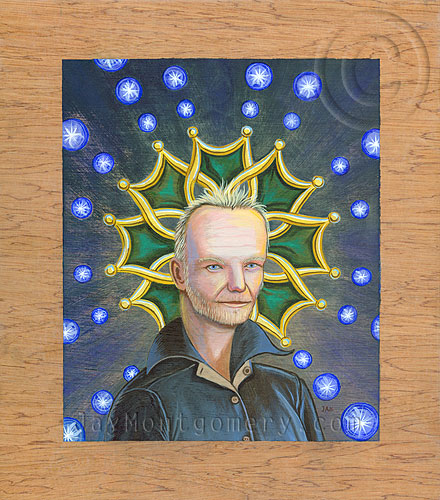
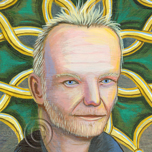
Sting Portrait

Here is a personal piece that I also did as a demo in one of my illustration classes.

Story behind the face:
In 2007 Sting and the rest of the Police became a knight of the L'Ordre Des Arts (Order of Arts and Literature) an honor bestowed by the French minister of culture in recognition of significant contributions to the arts. The green and gold medallion behind him is the what is awarded to all knights of the 'Ordre.

Acrylic painting on lauan hardwood plywood. Image size: 9.5" x 11.75"


Tuesday, December 02, 2008

I'm featured on Illustrophile!

Charlene Chua of illustrophile.com was kind to feature my site today (12/02/08) on this blog dedicated to showcasing illustrators and commercial artists. I have also been asked to do an interview with them... stay tuned.

Thanks Charlene for the extra publicity!

I also have been meaning to post several new pieces I have done as demos for classes. I hope to get to it soon.

I have been busy with a new illustration for the Hinman Dental Society, a civil rights poster, and a resort map. More updates hopefully soon.

Friday, November 14, 2008

Ya Ya Kids

Just finished a series of 4 t-shirt illustrations for a new line of clothing geared towards Moms and kids. The company is called Ya Ya Kids. The business model is to have Moms post photos of their kids getting their "ya ya's out" doing crazy fun things. The visitors to the site and company would then vote on the photos to see which of them gets turned into an illustration used on t-shirt and other apparel. These would then be sold on the web site as well as in retail stores. We are just getting started and have high hopes. The illustrations are at the printer now being printed. Check back for actual pictures of the shirts and updated Ya Ya Kids website so you can buy your own.

After many rounds of concepting we decided to go with a Dick and Jane style applied to modern and sometimes irreverent subject matter. Most the the Dick and Jane illustrator worked in watercolors and white gouache. These watercolors were painted on Ampersand Aquaboard and then were modified slightly in Photoshop to touch up some colors and facial details. These are not the same backgrounds used for the t-shirts. The warm background texture was added in Photoshop. The shirt illustrations were set up to be more of a vignette so they would work on serveral different colored shirts. I will not post those until the launch of the shirts on the Ya Ya Kids website.


Boyzilla

Loch Mess Monster

Princess Puddle Jumper

Baby On Board


Sunday, October 12, 2008

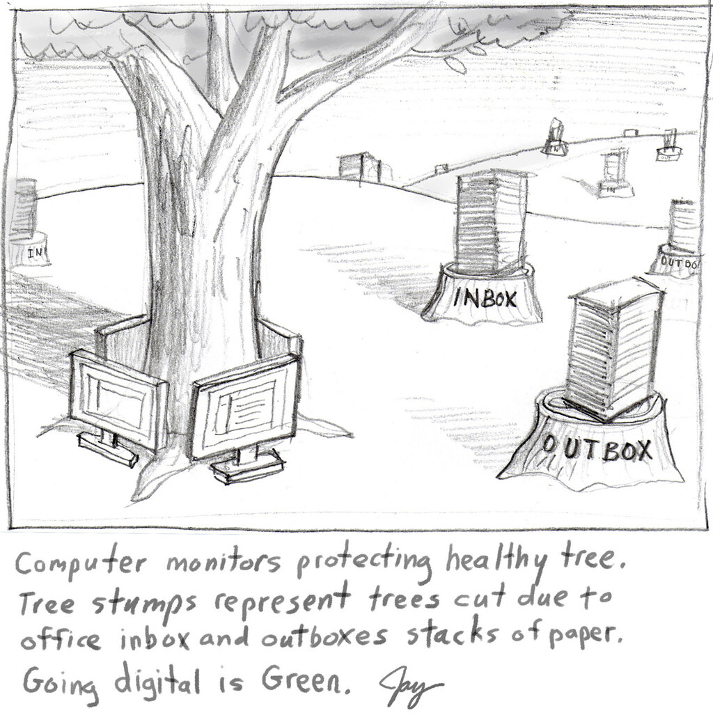
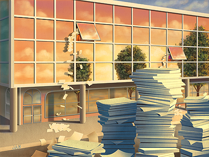
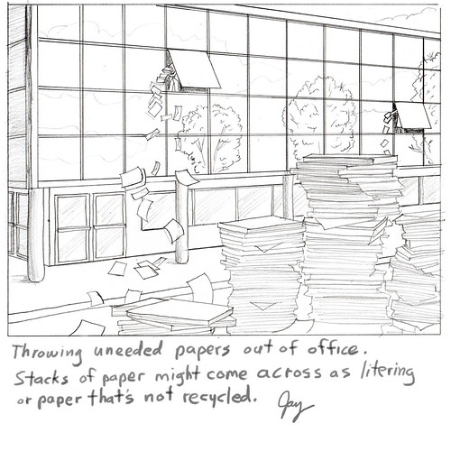
Paperless Office Editorial Illustration

Assignment for a Mortgage Servicing News. Art director's brief description is pretty much all I got: "man in small office building throwing papers out of window.
Pile of paper on the street..." I took it a bit further adding too many details.
This is the concept that the AD asked for and eventually went with.
This is another concept that the AD did not ask for but liked better. The editor liked the other requested concept so the AD had to comply. This has happened over and over again with editorial clients. I thought it was the AD's job to pick the artist and the art. Isn't that what they went to school for?

I had originally painted the colors as a normal blue sky day. I liked the way a changed it. After some thumbnail sketches it was totally created on the Mac using Illustrator CS3 most 85% of the shapes and Photoshop for the painted looking parts. Total time: about 10 hours on and off for a week.

A cropped detail that surprisingly and most frustratingly communicates exactly the same thing as the un-cropped version. I could have done half the work and got paid the same! Arggh!!

Comments good and bad are welcome!

Tuesday, July 08, 2008

Current Conservation Magazine Cover

This one I'm quite proud of. I did this illustration when I was at Portfolio Center in 1993. Today I got my copy of the latest issue of Conversation Magazine and it's on the cover! I'm really glad to be apart of such a worthy cause. I'm in good company with past covers art as well. Several very well known illustrators have graced the cover and now me. Thanks to Society for Conservation Biology. Also, this has been on another magazine cover and won a Best Cover award back in 1995. An oldie but goodie. Check out some other past magazine covers here.

Wednesday, May 28, 2008

My process

Here is a demo I did for my Electronic Illustration class. The link to the web page not only describes my process of painting and modifying the same Photoshop image for 3 different looks of the same image. The web page itself was an actual assignment as well. The style was something really different for me and I had lots of fun illustrating it. Let me know what you think.

The Devil Painting Process

The students created 3 different tarot cards of their choice in a style of their choice using Photoshop and Painter and then they created a web page based on those cards talking about their process. They all worked very hard on these and a great job overall. Here are some links to the students web pages.

Mary Wall
Matt Kelly
Sarah Pettis
Drew Botts
Fiona Handshin
Min Choi
Tanya Rodes-Colee
Alan Hawley
Jacob Smith
Ryan Stover
Briana Westmoreland

...more student links to come soon.