Showing posts with label new commission. Show all posts

Tuesday, February 09, 2010

Aqua Teen Hunger Force background!

After working on 6 movie backgrounds for Cartoon Network's "Aqua Teen Hunger Force colon Movie Film for Theaters" (yes, this is the full title exactly). They called on my pixel pushing skills again for the TV show. Just this past Sunday the new episode of the Adult Swim TV show Aqua Teen Hunger Force "Rabbot Redux" aired and it had about 2 min of air time using a background I did! Took about 2-3 weeks to do back in December
2009. A bit about the creation process.

1. This is what the Art Director, Bob Pettitt, sent me as a starting point. This was used as a "holder" for the animation build of the scene. After talking with me about the scenes needs and he sending me a few texture files, food items for the salad bar I got started.


2. I established eye an level horizon line using one point perspective. Then I created most of the base mechanical/architectural shapes in Illustrator CS4 then by copying and pasting into Photoshop CS4 I created several smart object layers.


3. I sent progress to the AD a couple of times. I did not do the Ferrari. They already that done, I just had to make sure the perspective matched the rest and fit in between the bed and fountain. I had to make sure that the layers of objects were set up in such a way that the characters could go behind all the elements. So each object was on it's own layer with transparent backgrounds.


4. After creating in smart objects in Photoshop, I used them as clipping masks to add textures mainly. On some smart object layers I added shadows and highlights as clipping masks. This is the final background low res version. The original is 12000 x 3240 pixels (40in x 10.8in at 300 dpi) with 411 layers! High Def Baby!

Meatwad's Luxury Room

Some details - indoor horse stable!
Stable Detail


fancy luxury bed! I used the Vanishing Point filter and the Liquify filter to apply the bed spread pattern.
Bed Detail


Some screen shots of how they used them in the end. It was about 2 min of airtime. Pretty funny little scene.

Water Fountain, Lamborgini and Bed


Horse Stable, Salad Bar and Sexy Ladies

If you want to see the whole episode you can go to this direct link on the Adult Swim website, but I must warn you that it's NSFW, but not R rated. It's not the type of crude humor that everyone can appreciate. (If there is such a humor.) It's only a 15 min show, but to skip right to the scene go to the end of the first video clip and the next clip will load and it's toward the beginning of that video file.


Friday, January 15, 2010

Served with Southern Hospitality


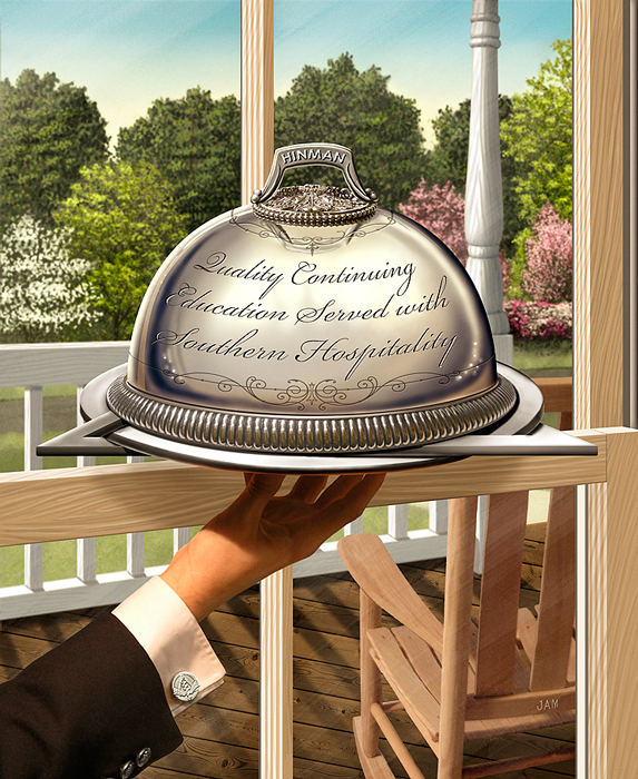
For the past 6 years I have had the honor to do the main trade show image for the Hinman Dental Meeting. The largest dentist convention in the USA held in my home town of Atlanta. Every year we come up with a new concept on basically the same topic of continuing education in Dentistry. This years theme was Quality Continuing Education Served with Southern Hospitality. So I had the idea of showing a server with a serving dome in a southern type home. They wanted to include all sorts of native trees, and a porch with a rocking chair. At first the image seemed simple enough to illustrate. But there were lots of depth and layers to the piece that needed to all work together and it proved to be more complicated than I imagined.


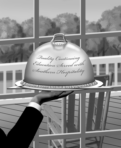
After doing a scribble sketch at a meeting with client. I started building this in Photoshop using mainly shape layers. Knowing that the layers would be moved around to come up with the best composition. This composition proved to be to complicated with too many panes and needing an opening in the porch railing.


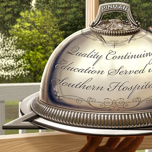
This was better but it was hard to tell that the server was inside the house. Plus the hand look like it had only three fat fingers. The angle of the fingers were a challenge to show all of them naturally. See the final hand below. The plate that the serving dome is on is in the shape of a circle and triangle which is the main part of the dentistry logo.


Final approved illustration. Notice the Hinman logo was used as the cuff-link.


To add pop to the image I slightly blurred the background. All elements are on there own layer. I also added a very subtle texture.


Let me know what you think?

Saturday, November 21, 2009

New Illustrated Book!

You might recall an earlier post about a new book I illustrated. Well it's out! Just in time for the holiday's a yet another new book about Christmas...but this time it's special because it's illustrated by me! It's a different take on the ever popular poem "The Night Before Christmas" with 11 new highly detailed illustrations. "The Night After Christmas" by Jim Chapman was a challenge to illustrate and fun at the same time. I wanted to capture a more contemporary approach to the old tale to fit the modern subject matter of the this timely poem. It's about the cultural materialism that retailers have trapped us into forgetting the true meaning of Christmas. Here is a great description from the publisher Winepress Group.

Does Christmas seem like a stressful, unsatisfying ritual? Why do we go through this annual exercise of decorating, shopping, wrapping, and over-spending--only to vow we're going to do it differently next year? Was Christmas always this way? Or did our culture make it into something it wasn't meant to be?

If you've ever asked yourself these questions, you may well need this book. Christmas does, indeed, offer something more. Obscured beneath the tree, hidden inside the gift wrap, buried under plastic debt lies an enduring enigma that beckons us to reconsider. Somewhere in all the clutter can be found the key to a merry Christmas. For those who take a second look, there awaits a gift that can make every day a holiday.

"Delightfully riveting and insightful...I'm sure every person can relate. What a great reminder of what we so often forget!"

--Gary Smalley


It's a very nicely printed 24 page 8" x 8" hardcover cover book with book sleeve and spot varnishes. I designed the cover as well as illustrated it. I wanted to show hints of money in the design so I used a The colors turned out exactly how I wanted them. At first glance it's a typical Christmas book but at a closer look of each illustration you see something more. I had fun coming up with all the viewpoints compositions and details. The look of the credit cards were challenging for both the author and I. Since we could not show any credit card logos or anything close I had to come up with generic cards with all sorts of details. We went through several revisions until the author and his lawyer were satisfied that we were not going to be sued by the very companies that push all this materialism down our throats every holiday season. If you know what my family and I look like you will get a laugh at my photo references as well.

Now I have a book to give to my family this year for Christmas. Maybe your Christian friends or family would like a copy. It does make a great gift! I would love to hear what you think of the book and illustrations.

I would happily hand sign any books for free. Just let me know. jay at jaymontgomery dot com

Sunday, November 01, 2009

Ya Ya Kids T-Shirt Illustration

Recently finished a new Ya Ya Kids shirt for Manic Mommies Podcast. I had done 4 other traditionally with watercolor then touch up in Photoshop. This one was done in Photoshop after an creating a tight pencil with graphite.

No Whine Allowed

Here is video I created about my process.


Saturday, March 14, 2009

Resort Map

A while back in the beginning of November I was contacted by the owner of Chestnut Bay Resort in Northeast Alabama. He needed an illustrative map of his resort on Lake Weiss. He tried to get done through a relative and disaster stuck with this rejected map.


So he sought out a professional. He invited me to come up and take some photos and walk around the place. I can't remember the last time I was in Alabama, but before this trip I had never been to Centre, Alabama. The resort was unexpectedly nice and new and still expanding. Great for family retreats and lots of outdoor activities. So got the photos in Winter time and had to make the birds eye map for Spring or Summer time. I was quite swamped with SCAD and other freelance so I brought on board my good buddy John Nelson to help me out.

I met with John and talked about the basic layout and details and without him actually going to the Resort he sketched out in Photoshop a fairly accurate rendition of the place.

After a couple of rounds of over the phone revisions we had a final drawing.

Then I colored it in Photoshop.


They are going to use it on brochures, a large poster and a homepage clickable map showing photos of the different areas. See it on the ChestnutBayResort.com.

Saturday, January 17, 2009

Bridging These Truths

Over the last 2 months or so I have been involved in a large project creating a poster about change and hope in America. Brenda Stanley of The ABC's of ICU came to me with her creative vision and very rough sketches. From talking with her we had an immediate connection to the subject matter and drive to complete this highly detailed and symbolic poster. It was originally intended to be part of a presentation at Ebenezer Baptist Church in Downtown Atlanta (Dr. King's Church). Through the creation of the photo illustration all the other people who were able to see it saw a much bigger purpose for it. This poster had to go public and be made available to all. There are a lot of Obama and MLK Jr. posters, paintings and novelties out there. But we have not seen anything close to the detail and idea of the Statue of Liberty, King and Obama with all the civil rights moments throughout US history that has lead to this point in history of our 44th president, Barack Obama. So go to this brand new page to see in much more detail and read more about it. Show your support and recognition to this historical event in American history by purchasing a print for you and gifts to others. Print sizes from 20"x 12" to 60" x 36". Comments welcome.


Friday, May 02, 2008

Goofy Looking Puppet

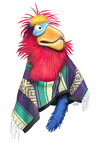
Recently finished a spot illustration for Crusader Magazine. It's a puppet from a puppeteer ,Julie Shockey. Created in Photoshop.

Friday, April 18, 2008

Holy Shroud of Ron

I recently had the pleasure to work with Tony Hendra, the former big time editor of National Lampoon and Spy Magazine. I did an illustration for one of their mock ads for this satire publication called My Wall Street Journal. They just released it to slap Rupert Murdock in the face for buying the Wall Street Journal. It's 25 pages is filled with hilarious articles and mock ads.

I had the challenge of creating a Shroud of Ronald Reagan. You know, like the Shroud of Turin, except this a is replica of a face-peel left on a towel. The holy image of Ron was left on the towel in all his holiness glory.


Check out the print ad shown in My Wall Street Journal.


Murdoch is Outraged!

Thursday, March 27, 2008

Path Tree for Dentists

New Illustration for the 97th Thomas P. Hinman Dental Meeting 2009. This is the 3rd year in a row I have had the pleasure of working with the Hinman Dental Society on creating the main image used on all their advertising, materials, signs, printed materials.

This upcoming years theme is about continuing education. So my idea was to show a tree representing growth and the branches turning into path ways leading to certain areas or dentistry.

Technique specs:
17” x 21” image with a 1.5” crisp white border all the way around. Total board size is 20” x 24”. It was painted in acrylic on a gessoed board of masonite. Nice a sturdy and archival quality. There is no white type on the paths in the original. That’s part was done in the computer. With the original you really get to see the textures of the surface unlike a digital file or print will ever do. Let me know what you think.


Sunday, March 02, 2008

Autotrader

Autotrader.com called me a few months ago to do some Illustrator characters that would then be animated in flash for online training. I did one version with outlines and one without. Still waiting to see if they want me to do more.

Sunday, January 06, 2008

Pharmaceutical Convention Main Image and Icons

A revision of another illustration I did for another Atlanta convention. They wanted a classic charm of the city of Atlanta.

Main AAPS Conference Image


This Pharmaceutical imagery for the 2009 AAPS convention was all done in Photoshop and Painter. They wanted a old world classic feel using modern equipment and objects. Tough to pull off. What do you think?
AAPS icons

Monday, December 03, 2007

Two new jobs for Source Media

In the last month I did these two illustrations for the same client. The first one is typical of my style and what people usually contract me to do. They were very happy with the end result and so they wanted me to do another with the same on time and on budget customer service, but in a different style. The comic book hero one was something very different for me. I have had a true appreciation for comic book artists', but even more so now.


Credit Score Confusion for Mortgage Technology Magazine.


Mortgage Protector for Broker Magazine.

Friday, September 07, 2007

Atlanta Gas Light Weather Forecast

Right after I finished the first job for AGL they wanted me to do another. This time for postcard for the Metro Atlanta area. They wanted a generic TV screen showing a 5 day forecast of 100% thunderstorms. Quite simple when you think about it, but when you actually do it there is a lot of design decisions to be made. I loosely based it on the Weather Channel screen with some significant changes. This was 80% done in Adobe Illustrator, the 20% was the clouds and distorting the flat screen elements in Photoshop to fit the screen in perspective. They wanted it cropped on the top to make the screen as large as possible on the postcard. I completed the whole screen if needed in the future. The whole process took about 1.5 days of work and 8 days of waiting for the clients response.

Thursday, May 17, 2007

New print available - His Life

Just announce a new painting is available for for print purchase. Late 2006 I was commissioned by new company called Heirloom Christian Arts. It was a complete pleasure working with Camilla Raymond on the project which gave my ample time, creative freedom and generous compensation to create the new painting based on a one inch high piece of jewelry. I transform the message and detail into a 24" x 36" painting using a relatively new medium called Chroma Atelier Interactive Acrylics. It's an acrylic paint that allows you keep it wet on the surface on your painting for much longer than conventional acrylic paints. This gives way to an oil painting look without all the harsh mediums of oils and using water as thinner. I loved the process! I even made a step-by-step demo of the process for my Materials and Techniques II class at SCAD-Atlanta. If you would like to get a PDF of the step-by-step process please email me. The painterly feel and hand done look is a little different from most of my work, but it was fun to loosen up. Let me know what you think!

His Life


His Life - Detail

Signed and numbered edition of only 50 giclee prints in various sizes, greeting cards, and more are available exclusively through Heirloom Christian Arts.

Thanks for looking!